Killer Cover of the Week

Unfortunately, the cover art wrote a check that the story itself could not cover. Although Thanos played a significant role in the event, he was by no means the central character. Nor was the Infinity gens as important as the title suggested. It was no where near the event that the Infinity Gauntlet was, which is sad, because the Mad Titan is such an interesting character, complex and ripe for exploration.
That’s what made me a little wary of the new series from Marvel called Original Sin. It too started with zero issue, wherein Nova decides to see the Watcher on the Moon to see if the Watcher might be able to tell Nova where his father is.
The last time I saw the Watcher, Uatu, he was in the pages of Mike Allred’s FF, a proud new father. The Uatu of Original Sin is something altogether different, He is a solitary figure, almost mute, almost in that he says one sentence to Nova by the end of the issue. There is a heaviness with the way he is depicted, as if he is being led to his death, and, in fact, that is exactly what happens. By the end of the issue, he has been killed, his murderer a secret.
The series then picks up with Nick Fury assembling a team of “investigators” to determine who murdered the Watcher and why. It is an interesting direction for a super hero book, a kind of twist, in the same way that Bladerunner and Firefly blended genres to come up with something new.
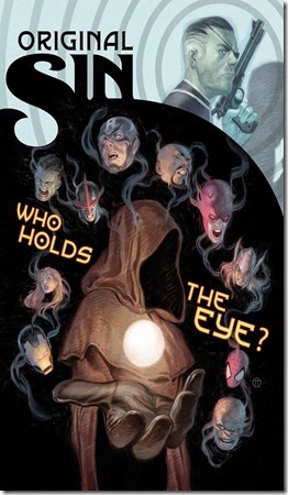
The cover art adeptly drawn by Julian Totino Tedesco does a great job of blending genres, in this case, as was mentioned before, the superhero genre, and, the pulp fiction genre. The cover of Original Sin #2 is not different.
The palette of colors used by Tedesco reminds you of the covers of the dime store novels of the fifties. It is a mixture of muted browns and reds, most of them dark. The banner of the book is a kind of antique green, faded, barely perceptible for the figure of Nick Fury in the background.
The figures on the cover are the figures found on the pulp novel cover, except they are super heroes. Tedesco shows us the side profile of Fury, a gun held up to his face, barrel pointed to the sky, a gritty look on his face, a pose made by any number of the hard boiled detectives or spies of pulp fiction. A set of concentric circles radiate from his person, hinting of a target. The icing on the cake is his shadow which is a fingerprint, evidence of a crime, key to solving murders.
It echoes perfectly in the book, Nick Fury as the lead investigator of a murderer mystery, trying to figure out who killed the Watcher and, in unraveling the mystery, becomes a target himself.
Underneath, there is a shadowy figure in a brown robe, his face hidden under a hood. He is meant to be mysterious, hence the words splashed across the cover, “Who holds the eye?” His hand is extended to the audience, a globe hovering just above his palm. He offers it to the reader, or he wields it against the reader, its hard to tell, capable of both meanings.
We later find out that this is the eye of the Watcher, who as anyone familiar with the Marvel universe knows, records all of Earth’s events and knows all. The eye as we find out holds all the knowledge of Earth. The offer by the mysterious figure to the reader is the ability to see the secrets of the Earth itself, things that have not up-to-this point been revealed. It is a call to don new eyes to see things differently, and, as with all events, that is what Marvel promises readers with his series, shocking changes.
Around the central character is the faces of various superheroes. There is a distinct choice in the depiction. The faces front facing or level. They are turned at odd angles, looking down, up, to the side, anything but looking at the reader. In addition, their faces hold the expressions one might find on the figures of a dime store novel, looks of horror, terror, frustration, and anguish.
The look of Captain America is quite profound. Captain America is supposed to be fountain of bravery, a solid rock of hero, in that he is supposed to be a manifestation of the strength of his namesake. And yet, his face pulls away from the cover, horrified by what he sees there. It is a face of avoidance, clearly disgusted.
On all figures, a mist rises and wraps itself, the mysterious figure and the superheroes alike, suggesting that all the figures are burning, as if they were in hell. Certainly, the ominous, almost cult-like manner that the robed figure is placed on the page and the faces of the superheroes give that impression.
The message implied is that there are secrets contained in the eye of Uatu which have the superheroes terrified and anguished, secrets that which have been offered to you as the reader. It is interesting to note that in the promotional pieces released by Marvel, they tease the event without such questions as “What have you not been told?” and “Everyone has one.”
I am excited about this series. For two issues, it has delivered. The writing is tight, and the story is clean. It does what it promises. It is creates a shroud of mystery and compels you to continue to by the series with the hopes of unraveling what might be revealed.


Comments
Post a Comment